
I am adding a bounty to this question, hoping for some scientific research results. Thank you everybody!
I have recently tried working on dark backgrounds, and it seemed (to me) to be easier on the eye. However, today I read Gerrie Schenck's comment on this answer [1], in which he said that mainframe developers were advised to use white backgrounds instead of black, as it is said that white is easier on the eye.
So which one is actually better for the eyes in the long run? I would be thankful for any (scientific) references about the subject, as my eyes really need some relaxation.
I wanted to make this question a community wiki, but I think that the least I can do to thank people is to reward their answers, so I'm leaving it as a normal question.
Many, many thanks for your help.
P.S. I don't know which tags would be appropriate for this question, so I'd be grateful if you could tag it in a better way than I did.
 ACCEPTED]
I looked for published scientific research on your question. There's quite a lot out there, the trouble is technology has changed a lot and so for a lot of them it's unclear whether the research on television screens still applies. I found two recent papers which researched text on screen, both of them comparing white-on-black and black-on-white in experimental setups. Both of them found that black text on a white background is the most effective combination.
Hall and Hanna (2004) examined how colour combination affects readability and retention by experimenting on 186 test subjects. They found that both the readability scores (measured subjectively through a questionnaire) and the retention scores (measured through a quiz) were higher (i.e. better) when the text was displayed black on white as opposed to white on black.
Buchner and Baumgartner (2007) performed a similar experiment on 80 test subjects, except they measured the subject's performance on a proofreading task on a TFT display (Hall & Hanna did not mention the type of display they used). Buchner and Baumgartner arrived at a similar conclusion, with users consistently achieving higher proofreading scores when a black-on-white colour scheme was used.
So it appears that we can be quite sure in concluding that black-on-white text has been experimentally determined to be better for comprehension than white-on-black text when computer displays are involved. This is also backed up by a lot of older research on older monitors such as television screens.
However I should add that this does not eliminate the possibility that black-on-white still produces higher reader fatigue. If I find papers on that I'll let you know.
References:
Below I include links to the two papers I just described. I'm not sure how familiar you are with scientific journals, but sometimes authors are allowed to post draft versions on their websites, which, being draft versions, may have errors not present in the final versions. The problem being, of course, that you need to have a subscription to access the final versions. So that is why we make due with the freely-available versions of the papers.
RH Hall, P Hanna - "The Impact of Web Page Text-Background Color Combinations on Readability, Retention, Aesthetics, and Behavioral Intention" - Behaviour & Information Technology, 2004 - http://sigs.aisnet.org/sighci/bit04/BIT_Hall.pdf [1]
A Buchner and N Baumgartner - "Text – background polarity affects performance irrespective of ambient illumination and colour contrast" - Ergonomics, 2007 - http://www.psycho.uni-duesseldorf.de/abteilungen/aap/Dokumente/Ergonomics-2007-Text-background-polarity.pdf
Visual fatigue research: Unfortunately I could not find very much research which measured computer screen visual fatigue in comparison to black-on-white text as opposed to white-on-black. The only piece I could find was a short reference in " Reading text from computer screens [2]" by Mills and Weldon (1987) from the journal ACM Computing Surveys. Section 4.1 of that paper, titled "polarity", goes over important works at the time, including this piece:
In contrast to the results in these studies, Cushman [1986] found that subjects who read continuous text from positive contrast (light character) VDTs reported less visual fatigue (as measured on a subjective rating scale) than those who read from negative contrast (dark character) VDTs.
I've tried hard to access the Cushman (1986) paper, titled " Reading from microfiche, a VDT, and the printed page: subjective fatigue and performance [3]" in the journal Human Factors, but I cannot get it with my current subscriptions without paying $25. So I'm unable to tell you anything about the experimental setup of Cushman or whether his or her claims still apply today.
Even though Cushman appears to make the conclusion that a light-on-dark colour scheme actually induces less fatigue, I think there's one caveat to remember. Mills and Weldon also mention that back in those days, computer screens used a light-on-dark colour scheme because flicker was less apparent. It's possible that the flicker of the dark-on-light scheme was causing the visual fatigue. These days, monitors don't flicker (as much), and so the claim probably still does not hold. This makes me question whether flicker is actually the true primary cause of computer screen visual fatigue, maybe I should look into this.
Another interesting point, Mills and Weldon also say black-on-white text on paper is more readable "due primarily to the larger number of eye fixations required to read white print on a black background," for which they cite a paper by Taylor (1936) called "The relative legibility of black and white print" in the Journal of Educational Psychology. So if we presume that the same reason applies to computer screens, then that is the root cause for all of this contrast polarity readability business! It's all because of eye fixations.
[1] http://sigs.aisnet.org/sighci/bit04/BIT%5FHall.pdfYou want the light being emitted from your screen similar to the rooms lighting environment.
A book uses subtractive colour. A bit of white paper reflects light, the text "blocks" the light. The paper is never brighter than the light hitting that paper (which your eye is used to)
A black screen is emitting less light. That is how additive colour works. In a dark room, the screen is emitting the same amount of light as in broad daylight. That is the problem, not the actual colours.
Somewhat-proof, the link posted by nickf: Ironic Sans: Ow My Eyes [1]. If you read that in a well lit room, the black-on-white will be the most pleasant to read. If you read it in a dark room, the white-on-black will be nicer.
The reason I have most applications configured as dark as possible is the monitor is almost always brighter than it's surroundings.
Ideally the "bright bits" would match a white bit of paper in the same room, the blacks would match a black bit of paper. The black of a monitor should match (although there is some influence from the backlight), but the whites are not (as the monitor is a light source).. thus, having less whites on screen means less artificially bright light.
Summarised less horribly:
Not exactly scientific, but I've always found Maddox's argument on the subject [1] compelling:
[1] http://www.thebestpageintheuniverse.net/c.cgi?u=faqI've chosen a black background for most of my text because it's easier on the eyes than staring at a white screen. Think about it: your monitor is not a piece of paper, no matter how hard you try to make it one. Staring at a white background while you read is like staring at a light bulb (don't believe me? Try turning off the lights next time you use a word processor). Would you stare at a light bulb for hours at a time? Not if you want to keep your vision.
A lot of wrong answers here.
Black screens do not use less power. The back lights use the same power, but their light is blocked more.
If you turn down the brightness you will most likely use less power.
Staring at white screen is of course not the same as staring at a light bulb. Just as it is not the same as staring at the sun. Luminance levels are completely different.
Most monitors have 'text' option for their brightness/contrast. Use this one or just turn down the brightness and contrast to a reasonable level.
As for white on black or black on white - look for a second at the monitor. The answer is in front of you. Smarter people have already decided what is best. (hint: black on white)
Although not strictly about health effects, a guideline for optimal text readability can be found in chapter 11 [1] of " Research-Based Web Design & Usability Guidelines [2]" by the U.S. Department of Health & Human Services [3]:
Guideline: When users are expected to rapidly read and understand prose text, use black text on a plain, high-contrast, non-patterned background.
Comments: Black text on a plain background elicited reliably faster reading performance than on a medium-textured background. When compared to reading light text on a dark background, people read black text on a white background up to thirty-two percent faster. In general, the greater the contrast between the text and background, the easier the text is to read.
Sources: Boyntoin and Bush, 1956; Bruce and Green, 1990; Cole and Jenkins, 1984; Evans, 1998; Goldsmith, 1987; Gould, et al., 1987a; Gould, et al., 1987b; Jenkins and Cole, 1982; Kosslyn, 1994; Muter and Maurutto, 1991; Muter, 1996; Scharff, Ahumada and Hill, 1999; Snyder, et al., 1990; Spencer, Reynolds and Coe, 1977a; Spencer, Reynolds and Coe, 1977b; Treisman, 1990; Williams, 2000.
The comment leaves open the question, if light text on dark background would be an acceptable alternative. Perhaps the sources provide more evidence.
[1] http://www.usability.gov/pdfs/chapter11.pdfThis subject drives me crazy, I'm always being told by people who have no working experience of this subject that I don't know how to do my job. I am a working designer and have been doing detailed colour work for over 20 years, have been lectured on many occasions on colour and know it fairly well. I am the owner of a successful branding consultancy http://rareformbranding.com (if you take a look you will see what colours I am using has a relevance to this subject).
The issue is a little complicated and would take too much time for me to detail all aspects of the issue here, but just to clear a few thing up, here goes.... Newspapers use black type with a serif on white paper because in a living environment, in an uncontrolled matter such as paper, light bounces of the page and hits the retina, the eye needs the contrast in this way as the eye needs as much information it can get to understand what it is seeing. The eye here is doing all the work.
Monitors work entirely differently, they emit light, pushing light out, the black area where you see a font uses less light, the edges here are being blurred by the white light bursting past it. This causes 2 problems, the blurring of the black typeface by the white light bursting round it, but worse still and even more poignant, the bright light that is being 'pushed' into the retina causes headaches. So, paper is just the same as every other object that eye has been adapted for over 70 million years of evolution, the monitor does it in a totally different way, voila! headaches... so why are so many people intent on using a theory based on something so different, the only similarity is that someone is tying to read.
There are ways around the issue, yes you can turn down the brightness of your monitor so that you don't have to deal with so much light going into the eye, but risk legibility due to lack of contrast, or you can use a light grey on a dark grey/black background, thus your eye having to deal with less bright light, less headaches but still retaining contrast.
There are other issues at hand, as I have mentioned, too many to cover, but they are as follows; eyes being used with constant white, blackboards in classrooms have a reason - not just cost, environmental light, distance colours compared to close colours, external light noise, colour blindness, printable web pages etc. All these things have some importance within this subject, but believe me, if you want to avoid headaches and want to improve clarity, shades of grey are better.
I apologies if I am ranting, it isn't aimed at anyone on here, I have just spent the last 20 years of clients telling me how to do my job, when the only experience they have is with what they have heard in 'general' terms and are applying this conclusion to screen based issues. A little knowledge is a frustrating thing!
Most people who say they prefer white text on black background have in fact a monitor that is way too bright for their working environment, they just don't know that and nobody has ever told them so. Before you do experiments like this, one needs a professional calibration tool to adjust the monitor brightness first. If dark text on light backgrounds gives you headache over the time, your monitor is too bright.
With an accurately calibrated monitor, most people will find dark text on bright background easier to read for a very simple reason: A monitor with white background and dark text emits a lot of light (all white pixels do, only the very little dark ones do not). A dark background with white text emits very little light (no black pixels do, only the very little white ones of the text). Most people think less light is easier on the eyes... well, not completely wrong, but our eyes were made to catch light, light is not their enemy. As long as it's not too much light (monitor brightness overkill), our eyes can handle the light pretty well. But when reading text, there is more than more or less light. There is the question how easy it is for our brain to recognize letters. To read letters most effectively, we must be able to recognize the smaller difference between a l (lower case L) and a i for example (and those difference are really small).
Thus we need to focus on all the tiny differences that makes every letter unique. Focusing is an entirely different topic most people ignore. When the monitor emits a lot of light, our pupils will shrink. When the monitor emits very little, they will grow. See this video for example:
Now the smaller our pupils are, the easier it is for our eye to focus on very fine grained details. The bigger they are, the harder it gets and the more the environment starts to blur. As a bright background emits a lot of light, our pupils shrink and we can focus much better on fine grained details. A black background emits little light, our pupils grow, the whole thing starts to get blurry, letters seems to be moving (jittering) on the screen. In fact they are not, our eye are jittering as it has a hard time to focus on the letters. This is the reason why you start seeing "ghost letters" when you stare at pages like this one:
http://www.ironicsans.com/owmyeyes/
You'll never see ghost letters on a white background page. What most people also don't realize is that when using a black background, they try to compensate for the effects mentioned above by making the line size bigger (adding more space between the letters), using a bigger font size (less small details to focus on) and making the fonts bold (causing them to emit more light). These are all measures only necessary to fight the otherwise negative effects of black backgrounds.
You can also see it like that: In nature, how often do you stare at black objects with thin lines emitting light? Do you know any? I don't. Our eyes developed through evolution to give us perfect sight in a natural environment, not for a monitor. Black background with white letters mimic nothing you can usually find in a natural environment. Our eyes were not made for this kind of "picture".
Update:
As Reberto pointed out, "colors" are easier to distinguish on a black background than they are on a white one. This is in fact true, I cannot neglect that. The reason is that you need a certain degree of contrast to distinguish text from background (try blue text on blue background with only slightly different shades of blue for example). When you have a white background, you create that contrast by using dark colors. When you are on a black background, you create that contrast by using bright colors. Since bright colors emit more light than dark ones, of course recognizing a bright blue/red/green as being either blue, red or green is easier than for a darker one.
That said, I'm no fan of white background either, I'm just a fan of bright background. That is not quite the same thing. And if your background has at least a "shade of color", certain other colors will clearly be recognizable and it won't be necessary to make them too dark just provide enough contrast.
Play around with this lovely tool [1]. It generates random color themes for syntax highlighting. You can pick between another bright or dark theme.
[1] http://inspiration.sweyla.com/code/?lang=cppI find full black backgrounds tend to create overly vibrant displays but white backgrounds are harder on the eyes over time. One option is dark but not black lower contrast background. For example Zenburn [1]
[1] http://slinky.imukuppi.org/zenburn/A response to what @Chris Pebble quoted re: Maddox's pro-black background.
It's a page of white on black text. Read the paragraph and then click the link at the bottom to invert the colours and see which you find easier.
[1] http://www.ironicsans.com/owmyeyes/There are quite a few factors affecting visual performance and thus, visual strain leading to potential health issues.
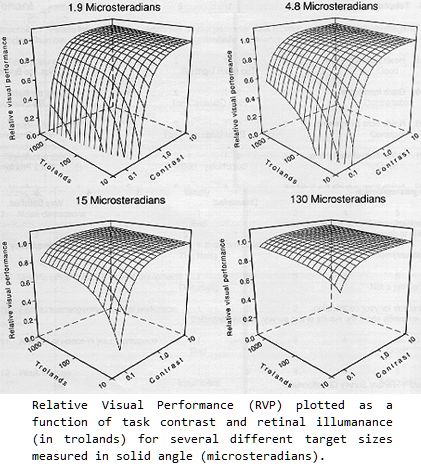
Rea & Ouellette (1991) [1] illustrate the importance of size and adaptation level in addition to contrast. The image below shows that when the task size is very small (1.9 microsteradians) visual performance drop very quickly with lower adapation levels and lower contrast. However, with larger task sizes (130 microsteradians), visual performance is hardly reduced at very low contrast or adaptation level. Bailey, Clear, and Berman (1993) have also presented a model that emphasises visual size rather than contrast.
Note: A dime held at arms length (2 degree cone) subtends slightly less than 1 microsteradian. 4.8 microsteradians is roughly the sphere subtending following ten digits: 0123456789
Other potential factors affecting the health of looking at a computer monitor all day:
So back to the question:
Which one is actually better for the eyes in the long run?
If your eyes are strained or uncomfortable, CHANGE YOUR ENVIRONMENT! Contrast should be high, regardless of whether it positive or negative contrast. Increase the default text size of your code editor and web browser. Eliminate sources of glare. Take a break and focus at different distances throughout the hour. All the things we know to do already .. but don't.
[1] http://irc.nrc-cnrc.gc.ca/pubs/fulltext/nrcc33103/nrcc33103.pdfI think high contrast is the most important factor. I'm pretty happy with the black on white that is the default in Visual Studio, Google, this editor, etc. However, I don't mind extended sessions in a command window either (white(ish) on black). Here are some links to studies pertaining to computer screen color schemes:
Some research has confirmed the connection between color and the interface’s visible structure. Taylor and Murch (1986) reviewed principles for effective color coding on video monitors. They found that not all colors were equally legible. Dark spectrum extreme colors, like red or blue, make good background colors. Desaturated hues and bright center spectrum colors, like green and yellow, make text that is more legible.
I used to use a black background on my text editor (back when I was using a language where I had a bucketload of colours for syntax highlighting). I found it easier to pick a large set of easily-distinguishable colours that way.
I use a white background now. I haven't noticed any significant differences in eyestrain, but I'm not an ergonomics researcher, and it was only ever my text editor (and command prompt), not other windows.
There's one particular blog I read which is white-on-black text. I've found that if I don't ratchet the font size up for that blog, reading for more than a minute or so leaves me half-blind with after-images for several seconds when I look away. I don't know why this should be, but I take it as a sign that dark backgrounds and small text are probably a bad combination for me. But then I wouldn't want to use small text all day in the first place.
I find an almost-black background quite comfortable and my last eye test was the same prescription for the past two years.
I've never used a black background for programming, but I do notice that when looking at web sites I prefer lighter backgrounds with dark text as opposed to dark background with light text. The reason seems to be that going from a dark background to a light background strains my eyes. Since most sites go with a light background and dark foreground I think staying with a white background is less strain if your work involves using other applications that use white backgrounds.
Programming is not reading. I prefer to read black on white. I prefer to write text in Word black-on-white. But I've discovered it's easier on my eyes, when programming, to use light on dark.
Font choice is important, too. I use consolas when programming, but I'd never use it for reading English text.
I think that's where most of these discussions fall apart. People bring up studies on reading, and they point to bad MySpace pages with hard-to-read text. Reading a blog is not programming.
Spend some time making two environments--one with a dark background and one with a light background. Try them both. For me, it's dead easy--I go right to the dark one. I'm fully willing to accept that people may choose differently. When I use light backgrounds my eyes hurt at the end of the day.
I've also noticed that people have different sensitivities to flicker. If I sit down at a 60Hz monitor, I'll complain. I can't believe that people can use 60Hz, especially with white backgrounds, but they do. 75Hz or better helps me. One thing I liked about old monitors was that they had really long persistence. This caused ghosting when the text was scrolled, and was terrible for games, but it really eased my eyes.
I'm assuming anyone who is like me (sensitive to flicker) will prefer to program light-on-dark.
Paper doesn't flicker. It doesn't have a refresh rate.
I've recently found that using an application like Flux [1] which attempts to match your color profile to the lighting of the room you are in, significantly reduces eye strain. Obviously I have no scientific reference here, but the app's website is relatively informative.
[1] http://www.stereopsis.com/flux/I don't know about health effects, but I found the following paper on the subject of backgrounds....
http://sigs.aisnet.org/SIGHCI/bit04/BIT_Hall.pdf [1]
[1] http://sigs.aisnet.org/SIGHCI/bit04/BIT%5FHall.pdfThis [1] experiment concluded that "participants performed the most quickly when contrast was highest (i.e. lighter background)."
[1] http://laurenscharff.com/courseinfo/SL98/readproj.htmlHow many of the people who have answered so far are over 40 years old and spent years using traditional CRT monochrome text-only monitors?
Apple were the first mainstream micro manufacturer to ship black text on a white background. Before I bought my first Mac, I had a VT220 which had that option and was happy to turn it on. The reason it took a while to be feasible is very simple - the resolution of dots available was too low to be able to read black dots as being consecutive lines. White dots blurred into a line with the coarse fonts available at the time, up until around 1984.
Something to consider in this debate is what value of white people are using. My monitors are set to a fairly yellowish white by contrast with the blueish-white to which VGA defaults on Windows.
Black text on white background.
I have two links for you, but they are both in German.
To summarize:
http://www.uni-siegen.de/fb11/aws/literatur/pdf/komp4.pdf
As a side note, for people who use multifocal eyeglasses, a white background is preferable. When it is white over black, text gets more distorted in the peripheral vision.
Just read: http://www.ironicsans.com/owmyeyes/ , which is interesting.. but why do eclipse/vs use a white background with a black font then? Is there a scientific explanation for this?
I think we all agree that colors like pink, red or yellow are bad for text in general (except to mark something), but what about blue for example? It has the shotest wavelength and I always thought the default windows xp background color is blue because of this..
I've tried white and black backgrounds and I honestly prefer white. It's partly to do with the code highlighting (I could change these but I'm used to certain colours) becoming illegible on dark backgrounds (mainly purple) and partly because I find black too overpowering (and therefore difficult to read). I also find it difficult to read from a black screen when wearing my contacts (subscription isn't as accurate as my glasses - and it's impossible to make it sharper without paying a lot).
When transferring from white to black and to white again I did notice white was slightly more harsh at first but you adapt fairly quickly. In contrast black is a lot less harsh. It also lights up your desk less (insomniac...).
On an ecological note black screens use less power =P
As someone who is starring at code all day long, i have tried both dark and light backgrounds. I've found the easiest combination for my eyes has been a dark (not black) shade with lighter (not white) text with subtle colour syntax highlighting.
I think that white versus black backgrounds are simply a matter of personal preference. Judging by the number of websites, desktop environments etc that default to bright backgrounds it seems that most people prefer a white background.
What is far more important is the relation of your monitor's brightness to the lighting of your room. Never sit in front of a monitor in a dark room. Even with a black background, you still get a huge contrast.
A quick google scholar search turned up this review study [1]. It's not exactly written with programmers in mind, but it gives some good hints.
Also, never forget that even your background may be black, that doesn't mean that your monitor isn't bright. You can easily light a room with a monitor that shows nothing but black.
[1] http://bjr.birjournals.org/cgi/content/abstract/78/931/582I personally find white text on a black background looks great - for a few minutes. After that it starts to make me feel nauseous.
I guess it's a personal preference thing.
In a dark room I prefer a dark background (and low lit fonts) and the opposite in bright environments.
A bright screen in a dark environment is more noticeable eyestrain than a dark screen (with well lit fonts) in a bright environment.
Maybe not answer to your question but if you have eye problems I recommend you to learn touch typing and stop looking at both your keyboard and monitor while typing. Instead look out of the window or something.
I actually believe that I even write faster this way because i can focus entirely on my fingers and not try to connect what i see with what I'm thinking.
Might be a bit hard when programming but if you're writing plain text it's really comfortable.
There is no doubt that a white background can be more harmful than a black one, but it depends on the brightness of your monitor. I recently got a new 24" monitor which is very bright. At the time I was always using white backgrounds for developing which was fine during the day but when it got dark my eyes would get increasingly irritated and itchy. Of course you can offset this somewhat by changing your monitor's brightness during the course of the day but I really found a dark background to be helpful.
Scott Hanselman had a useful post with a number of dark themes for Visual Studio: linkage [1]. I particular like the last theme.
I can still get a little annoyed when, during the night, I need to go to the screamingly bright SO site to solve a problem :)
[1] http://www.hanselman.com/blog/VisualStudioProgrammerThemesGallery.aspxChoose 2 complementary colours that are close to each other in the spectrum. Excellent choices are yellow and blue. (In fact my old Amstrad CPC464 came with bright yellow text on a mid blue background).
That said, you do not want to swap them round and have yellow backgrounds [1]. There are other psychological aspects that you need to be aware of.
I think the white v black debate rages on partly because black text on a white background is how you read paper, the trouble with that is that paper isn't a light source, unlike your monitor.
So I recommend complementary colours that have sufficient contrast and that make you feel good about viewing them. I use a light cream background to my windows and that seems to help with the "glare" of overly bright windows.
[1] http://psychology.about.com/od/sensationandperception/a/color_yellow.htmI've switched a lot of my programs to a black background, and sometimes use my Mac in negative mode (from the accessibility) so my IDE runs in black.
I find the reduced amount of light more comfortable.
When I was a kid and had CRTs, my eyes used to hurt a lot.
However, I can think of a possible medical reason (though I have no idea if it is valid); the risk for cataracts is supposedly increased by exposure to blue light (e.g., starting at the sky / sea) or even things that have a blue component (white snow). Maybe a black background reduces the amount of blue light that you stare into. Though that could be complete BS.
Have you tried using a yellow background. For paper, yellow is easier to read than white. That is why it is used on yellow legal pads and the original yellow post-it-notes.
It depends on what are you doing. I am using a white background. I tried with a black background few months ago, hoping it will be easier on my eyes.
But, it actually get worse. Not because white text on black background, but because of other objects on screen.
I am working mainly on ASP.NET and some WPF in Visual Studio 2008. Code editor is only 40-45% of my screen. The rest is covered with menus and toolbars. I tried with a full screen editor, but switching windows was annoying.
Finally, I gave up on a black background because the contrast between the editor and other windows was even harder on my eyes.
This was just my experience, not scientific research. A black background could be fine if I get a work that is mainly on the server side - no UI, no need for toolbars. Or if there is some nice dark windows theme that will go nice with a black background in the editor.
Most of the actual research quoted so far seems to indicate that, with high-res fonts at least, black-on-white is easier to read (speed of reading, as well as comprehension) and feels more "natural" (it can, and has been, shown that it's actually not so natural) due to us being used to reading black on white paper.
But much of the subjective, anecdotal, feeling (I wasn't counting, but seemed like the majority) was that white on black is easier on the eyes.
These forces are not irreconcilable. Even if you take out environmental factors (e.g., the advice that you should make sure the environment is lit well enough to match your display) - it may still be that you can read faster and more easily with b-o-w, but the overall brightness may still cause tiredness sooner than w-o-b.
I don't apologise for the few weasel phrases above - I'm not trying to make an absolute statement - just expressing my views.
But where this all leads me is that the optimum is dark text on a light background - but not black on white. The contrast should be high enough that the text is easy to extract without strain, but no more.
My personal favourite scheme (and I was pleased to see it's now been ported to XCode and TextMate, as well as Visual Studio) is Humane [1].
[1] http://damieng.com/blog/2007/10/14/colour-schemes-for-visual-studioThe Maddox link's rather contrived. I've stared bright on dark backgrounds with little problem.
Right now my Visual Studios is configured on a dark grey background with light grey/pastel text on top. I don't have any problems staring at it.
My problem for black on white is that over time, the floaters in my eyes becomes very visible and distracting with the large patches of uniform white background. If you're looking at the outdoors, enough things break the monotony, so that you don't actually see the floaters.
You're going to have to pry my pastel on black scheme from my cold dead hands.
I just want to add a little point that so far nobody mentioned: especially on higher brightness levels, white "glows" making white pixel appear larger than black pixels. This affects the form of text on black-on-white vs. white-on-black different.
Fonts are usually designed mainly with display black-on-white on mind. A font that looks good and is well readable in black-on-white may appear too thin and less readable in white-on-black.
I find that I use a black background for text editors where I do programming. This works the best for context highlighting. But when it comes to reading documentation, writing docs, browsing the web I find white preferable.
I can't tell much about scientific research, but I can propose a conclusion that may sum up the ideas mentioned before, based also on my personal experience.
I work a lot with code, and each time I have this possibility I turn editors into mid-light over mid-dark background. The reason for this are connected to what Chris Pebble wrote [1], that strong contrasts tend to be straining for the eye, either way.
The way it worka is probably based on how we perceive contrasts, backgrounds and foregrounds. Andy Rutledge wrote an excellent yet simple article on that [2]. Dark objects on white background attract our attention, it's the way we perceive the world. That might account for information retention and legibility.
When you go the other way round (light on dark), you might remember less from what you read, but the strain, both on the eye and the mind, is weaker, hence the comfort. When I browse the code, I strongly prefer to have a dark pastel theme, definitely. When I design, I use contrasts to attract attention.
I think that the key thing here is not the color itself but the strength of contrast.
[1] http://stackoverflow.com/questions/498698/white-light-vs-black-dark-backgrounds-health-effects/498726#498726White feels too bright. But black doesn't feel right right for me either, though for a different reason. So I've comprised and use grey. No problems since then.
Why get hung up on white text on a black background. Back in the DOS days I played with color combinations a lot because I was on the monitor for hours at a time. White on black was never my color choice, but neither was black on white. My preference was either green on black or yellow on blue. If you are going to compare dark backgrounds with light backgrounds start with what works best for each combination.
I recently switched to using a black background for my web browsing. I use several styles using the stylish add-on for Firefox. The result is a black or grey background (depending on the website) and the text is either light grey or green. The styles also stop any background image from showing up and images that are embedded into sites are dimmed down. So far, I'm enjoying what I feel is an easier time on my eyes, but that could just be because I think it should be easier on my eyes. I like the look much better and it feels less cluttered with the lack of background images.
A few issues I have are when I visit a page with lots of bright images, it tends to make the whole page hard to look at due to the images being so much brighter than the rest of the page. Also, as you would imagine, many sites have a few issues because they are supposed to be viewed on a white background, so some header images have a bit of white around them if they are not put together with transparent background-ed images.
One of the reasons I decided to use the black background is because I have a Macbook Pro with an LED backlit screen, meaning that (in theory, at least) the LED lights behind 100% black pixels should be off, reducing the amount of battery life used by the screen. Weather this is actually true I have yet to figure out, but the way display tech is going, we will soon have laptops with OLED screens, and black backgrounds on OLED screens will really make a difference.
I also realize I'm trying to bring a topic back from a year ago, but I read it and had something to add.
Personally I found for entertainment, dark is a better background. For the rest white is better.
The harder choice is when reading text all day long like when coding. I found one of the most relaxing is a dark-blue background (not black) with light text (not white). Like VIM Oceandeep [1].
To express the difference, it may be interesting to see a set of various VIM themes [2]. Pure white is too agressive I find.
For general websites however, pure white background seem one of the best choices (if the rest of the website is themed nicely).
[1] http://www.tomsdiner.org/pics/oceandeep.pngThis is not scientific, but: I tried different color schemes, and I keep returning to black letters on white background. It's what I'm used to for text; every book looks like that (well, almost), most serious web sites look like it.
Also, isn't the quality of the screen more important than the background color you're using? If your screen flickers or its display is blurred -- that's going to hurt your eyes.
I started using black blackgrounds back when I used lousy CRTs. I definitely had less eyestrain when I had a black background. Today, I'm not sure. It's more habit at this point, I think.
At the end of the day, I think the light/dark debate depends on a handful of variables:
Simply put, I've known people who have preferred white, black, and the various pastel colors (mostly green or yellow). I've found that the pastel green background in a bright room works very well, as does white background in a dark room works better for me.
Currently, I'm using a white background in a bright room (at work) and a darker room (at home). Guess it doesn't affect me enough to go in and change the preferences.
I prefer dark green on a light black background, though my urxvt config file has transparency set, so it depends on what kind of wallpaper I have. Though they all tend to be rather dark, and the default tint is set to darkslate.
Personal, non scientific viewpoint, I tend to prefer darker text on a lighter background.
Have found using dark greens quite useful, and tend to use shades of green for window chrome. Quasi scientific reason is that human eyes have more receptors for green, possibly as a result of evolving in an environment with a crapload of green (used to be anyway). Might be total BS, but it kinda works for me.
Was also raised on green screens, so have a nostalgic preference for a green vibe.
2 important things:
I was having a lot of eye problems a few months back, possibly needing minor surgery, had a few weeks (mostly) off over Christmas, and all better now, no surgery needed.