
I'm building a mood tracker app for iPhone and am running into a user experience issue - I would like users to be able to track their moods, along with other events in a vertical "history".
The mood that I'm recording are reported on an X-Y scale with X being Pleasantness and Y being excitement (The scale is available from here as CC project without commercial user Pictorial Mood Reporting instrument [1]) :

With a typical 1-10 mood scale, I can use smileys to convey the intensity of the mood, but not so with a 2-dimensional scale.
When I store a record of the mood, I present it on a history view later, hour by hour, with data displayed in little circles. Due to the small size of the iPhone screen, I can only show relatively small circles (32x32).
I'm wandering how to best convey the X-Y information from the graphic above to a user using a small 32x32 circle? I'm currently experimenting with a hue/saturation/lightness of the circle, which results in circles of different colors standing for different X,Y combinations, but I'm not sure many colors would be very intuitive to the end user - what's the difference between a mustard circle and a cyan circle and a green circle? It may be learned by playing with the app, but I'm interested if there are better ways of conveying such X,Y information visually to the user?

I was thinking of drawing an arrow within a circle, that would point from the middle of the circle to the X-Y position on the grid. This would give some reference to the user as to what mood was experienced. Maybe there are better ways? A combination of color and an arrow?

Here are the arrows and colors combined. The direction of the arrow indicates the direction of the touch from the center of the screen, and the size of the arrow indicates the distance (bigger arrow for farther away). Do you think it is possible to convey this information to the user?

Update: Here's my attempt at varying the hue/saturation/brightness to make each distinct region unique. As the user moves the finger on the screen, the color of the circle and the direction of the arrow changes, as illustrated below. The top left corner is irritability and tension, and it seems that red fits the bill. The bottom right is calmness and relaxation, which is blue. The rest is a mix of red, blue and green with a typical "pure" green being absolute center.
//for x and y ranging from 0 to 1
    hue = 0.33 +(x*1.3)*0.33 - (y*1.3)*0.33;
    saturation = 0.50+ 0.4*(sqrt(x*x+y*y));
    light = 0.1+0.6*(sqrt(0.5*x*x+y*y));

I think you have too quickly ruled out the most intuitive option.
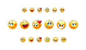
Humans are especially good at recognizing faces, and I think you might be surprised how well you can represent the nine different states with 32x32 smileys.
For example, take a look at this group of smileys:
http://gas13.ru/v3/pixelart/smilies_by_gas13.png
or very simply:
http://rookery.s3.amazonaws.com/3390000/3390174_dee6_625x1000.jpg
Your ideas are solid, but they are all suboptimal because there is no intuitive connection between shape, arrow length, direction and moods. A bit more so for color, but does blue represent sad or calm, and what color represents happy?
The vertical line/size/displacement option is also very creative, but it's not intuitive. You would have to train your users, which is the exact opposite of the "quick reference" ability that you're going for.
Nice graphics ;)
Your questions is interesting and hard to answer in detail. I think your way of solving the mood states by colour is good and understandable for people, because there is a direct combination of colours and their perception in terms of feelings.
I wouldn't use arrows in the circle, because this is a kind of very abstract concept. You have to have your xy-axis in mind to understand its meaning. And the direction of arrow might have a different interpretation than intended. Arrow down-right isn't to be thought of calm and relaxed. I would think its feeling bad or going to feel bad. (Or Dow Jones is going down ;)
What do you think about using shapes instead? Its easier to recognise and has meaning as well.
.
Some further readings
Johannes Itten:
- The red color of matter corresponds to the square. The severity and opacity of Red is part of the static and heavy form of the square.
- The triangle is the symbol of thought, and in colour, the bright yellow corresponds to its weightless character.
The blue corresponds to the district, moving without pausing as color.
Out of Bing translator of Media Wiki Bauhaus University [3] last paragraph Shape and Color

Source: Media Wiki Bauhaus University (Bing translator) [4]
I would not use colors alone for displaying the moods, since a 2-d color scale would be much less intuitive than a standard 1-d scale. Also, you have to keep in mind that colors can have different meanings in different countries and cultures. See: http://webdesign.about.com/od/colorcharts/l/bl_colorculture.htm
Our congnition is very capable of distinguishing faces, so taking a look into the Chernoff faces would be my first guess. They vary from the usual smiley faces, with a more straightforward design. See: http://en.wikipedia.org/wiki/Chernoff_face
I would take the best of both worlds and combine a 1-d color scale for the x-axis (pleasant/unpleasant) with a set of faces for the y-asix (arousal). Through the strict separation of the axes you can achieve high distinguishability and it allows better locating of a single paramter (pleasant or aroused).
 ACCEPTED]
Since each color can be described with three variables: hue, saturation and brightness, you could try to use a pair of these to code your X/Y.
A good starting point would be to use hues (green/red) for horizontal dimension (pleasant/unpleasant) and use brightness or saturation for the vertical dimension: high = bright/saturated, low = dark/unsaturated.
You could use colour, size and displacement of a circle from a mid line.
For example in the following image, I have converted the size of your arrows to the size of the circle, and the direction of the arrow to a displacement above or below the midline - as well as connecting the circle to the midline by a thin line so that it's clear which line it relates to.
I also made the grid and numbers rather fainter, added a gradient to the background and moved the rows a little further apart.
The colour is retained from your own examples, but the colour is not the only indicator of the mood as the size indicates intensity of arousal and displacement indicates the pleasantness (above the line) or unpleasantness (below the line).
So you can quickly see points of high emotion by the larger blob, and calmness by the tiny blobs. And you can see pleasantness by blobs connected above the line (as well as by the green-ness), and unpleasantness by blobs connected below the line (as well as by the blue-ness).

Stick with the bordered circle. The fill color being the color of the quadrant, while the border being a color corresponding to the closest axis ray. The closer to an axis the thicker the border. If nearly equally close to the center, or neutral, then, perhaps a solid neutral color; yet I hesitate to suggest white, grey, or black; perhaps a brown.