share
Stack OverflowWhat is the worst web usability error you have encountered?
[+36] [67] Alex Ati
[2008-12-29 22:47:03]
[ web-development web-applications polls usability ]
[ http://stackoverflow.com/questions/398963/what-is-the-worst-web-usability-error-you-have-encountered ] [DELETED]

Related to web pages / application, what is the worst web usability error you have encountered?

The one that hit you the most; that which arguably could trip the most users? Or, from another point of view, which error would you choose to be eliminated from the face of the Earth, if possible?

(3) This should probably be community Wiki. - George Stocker
[+124] [2008-12-29 22:51:50] George Stocker [ACCEPTED]

The worst one I've encountered is when a page says 'Field X must be entered' and then (because of a postback) it deletes everything I had written in the form. Or similar to that, going back to a page after accidentally navigating away erases all data I had saved in the form.

Very Irritating.


SO just did that to me when I pressed back after arriving at the captha. - recursive
It can even be worse: clear anything and the error message is that a field has wrong contents... - Gamecat
The going back/forward problem has been resolved by Opera. It just remembers what you entered itself. This can cause problems though... - Darryl Hein
So close to Guru... KHANNNNN! - George Stocker
Darryl Hein, many browsers do that but on Safari and Firefox (I think, Firefox may have improved since I last used it regularly) it depends entirely on caching and the headers that affect it. Does Opera repopulate the form even if the page can't be retrieved from cache? Does it remember the state of non-text fields? And best of all, does it restore state for event handlers affected by the fields when restoring to non-cached pages? If so, that is awesome. - eyelidlessness
What about passwords? Does it annoy you that they go missing from or user POV, or do you understand (and concur) this as a developer? - cwap
1
[+72] [2008-12-29 23:06:51] Bjorn Tipling

The worst web usability error, worst because it's so easy to fix and yet so prevalent, is not using a label element with form elements. The consequence of not using a label element is having to click tiny checkboxes, radio boxes, and input boxes instead of the text label next to them to toggle/select.


(2) I don't understand why more people don't use this. It's such an easy thing...aways makes me wondering if it causes a problem somewhere. - Darryl Hein
(1) Also, its a recommendation with the WCAG Accessibility guidelines - so definitely worth that extra minute or two ensuring your application uses them well. - Amadiere
(32) I seriously think there's a large number of programmers who simply aren't aware of the functionality. - Kibbee
It's so prevalent that, as a user, it's not worth doing anything other than just going straight for the checkbox itself, IMHO. Consequently, I don't even notice if it's done or not. - jTresidder
jTresidder, I think I've seen a major shift over the years. More often than not, clicking a text label works. One note: Older Safari versions (through 2.x, IIRC) did nothing when clicking label elements. - eyelidlessness
@Kibbee I thik you're 100% correct. In the past, some of the libraries/frameworks/toolkits for generating web forms made this error too which I think didn't help things at all. - James Schek
This is a great rule, you should always use a label with form elements. +1 - Yar
for the lazy, you can just do this: <label><input type=checkbox />some name</label> . you don't have to worry about ids or the for attribute that way - Neil McGuigan
2
[+47] [2008-12-29 23:19:10] Ben
  1. Click-through pages
  2. Background music (which of the 25 tabs I have open is creating that noise!)
  3. Most instances Flash (apart from video)
  4. You need to "register" to perform even the simplest task
  5. Most "call to action" images
  6. 10pt or smaller font-size
  7. 3rd party analytics code/adverts that take an age to download
  8. Using red and green alone to distinguish between things (leaving most colorblind users cold)
  9. Using images that infer more meaning than they actually should
  10. Overly complicated forms with a hundred fields and drop downs
  11. Useful links pages (so 1997)
  12. Unexpected postbacks
  13. Most instances of opening a new browser window
  14. Checkboxes where its not obvious whether a check is a positive or a negative indication

...and the biggest usability error of all, that most sites are guilty of, is presenting WAY too much information on each page.


(2) The links page is not a web usability problem. I agree with the rest thouhg. - the_drow
I'm with you on fonts. Except I think 10pt is still too small. - Instance Hunter
Background music: YES! Font sizes: by far not the worst; just Ctrl+= a few times. - romkyns
#11 doesn't seem like a usability issue as such. - Rob
3
[+34] [2008-12-30 16:26:13] Jim In Texas

Telephone number fields that are too stupid to filter non-numeric characters, instead insisting on the One True Way to express a phone number.

That is, user enters phone number 512-555-1212, or 5125551212. The page pops up an error alert "PHONE NUMBER MUST BE ENTERED AS (NNN) NNN-NNNN".

You'd think any programmer worth at least minimum wage could do better!


(8) Amen to this. Same thing for credit card numbers. I'm going to trust some site to take money out of my bank account, when it's baffled by hyphens? - fenomas
(2) jQuery.maskedInput is a godsend for this sort of thing. - Adam Lassek
(8) And what if I live in some other country where the phone number format is (xx) xxxx-xxxx - Ken Ray
(1) Jim In Texas, While of course it's easy to solve phone number formats for a single phone system, as Ken Ray begins to point out, it becomes a much more complex task when you want to accept phone numbers from around the world. At a certain point, you must either accept that some phone numbers may be invalid, or impose some arbitrary limits. Even if you cross-reference country and phone numbering systems, you run the risk of rejecting submissions from people who use cell phones from out of country. It's ultimately not something that can be done right by many of even the best programmers. - eyelidlessness
@Jim, I agree, and thanks for posting this. What a complete waste of the user's time. - p.campbell
@eyelidlessness points out the more interesting (and fundamentally, worrying) argument - assumption of a single locale; poor internationalisation, and a poor grasp of even the simplest of issues. - Rob
@eyelidlessness, but what about just assuming that a user knows his/her own phone number and what format it should be in? Is it really that terrible if your database contains both phone numbers like 800-555-1212 and like (800) 555-1212? - Kyralessa
(1) @Kyralessa, it's terrible if you plan to do more with the data than store it. - eyelidlessness
4
[+26] [2008-12-29 23:02:29] Rob Kennedy

Qwest's main login form "checks" the password to make sure it's "valid" without actually submitting the form to the server. Before it allows the form to be submitted, it makes sure the username and password fields consist of the "allowed" set of characters. Once those checks pass, the form is submitted to the server, where the username and password are really checked.

The problem is that the client-side script that checks the password doesn't have the correct password rules. The script thinks certain characters are disallowed when they're really perfectly fine.

I know certain characters are perfectly fine because my password includes some of them! The initial signup pages didn't check password validity, so I had no idea that the password I chose would later bring me this trouble. Thus, Qwest rejects my login without any network traffic at all. And customer support isn't helpful, either, because customer support isn't set up for accepting bug reports from people who actually know what they're talking about.

There's another login form elsewhere on the site that doesn't use the script, but it always takes me a while to find it. Instead, I've taken to using FireBug to set a breakpoint after it's checked my password, and then toggle the flag to let it consider my password as valid.


have you considered changing your password to something that passes the javascript check function? I suppose your way means that it's that much more difficult for an attacker to log in as you, but it's harder for you, too. - FryGuy
(7) +1 for your ingenuity with FireBug. Also for the fact that you don't use IE. - yfeldblum
+1 for confirming I'm not the only one who does this w/ FireBug (not Quest's site, but same concept elsewhere). - BQ.
(16) Why do passwords have 'disallowed' characters anyway? Aren't they being hashed before storage? - Charlie Somerville
(3) @Charlie Somerville: Hopefully... - nilamo
5
[+22] [2008-12-29 23:05:50] Jason

For the love of all that is holy, I cannot stand sites that cannot intuitively handle dates. Many travel sites will balk if you only enter "mm/dd" instead of just making a reasonable assumption about the year. Likewise, some sites insist that you must enter leading zeroes, or force you to use individual dropdowns to build a date.


I wish I could give this answer more upvotes, especially for the points about zeroes and dropdowns. It's high time for a built-in datepicker input type. - eyelidlessness
(1) Another place where localisation issues can crop up, of course. - Rob
6
[+20] [2008-12-30 18:55:03] unbeknown

Not accepting correct email addresses. This is especially notorious with '+' in the address. Commercial sites have lost my business because of that.


(1) I once gave my electric company an e-mail address with a '+' in it for paperless billing. Their form took the address, but their billing software apparently couldn't handle it. I never recieved a bill, and forgot about it (it was my first apartment, paying bills wasn't routine yet). 6 months later I got a rude surprise when they snail-mailed a threat to cut off my electricity if I didn't pay my bill! - Jon Quarfoth
(2) I just got this the other day. A site told me my e-mail address was already in use. When I asked it to send my password (or reset, whatever), it said there was no such user. So I tried using myemail+thesitename@gmail.com, and it said the e-mail address was invalid. IDIOTS. - Kyralessa
(1) +1 I have an email address with multiple underscores before the @, and some things (including the Australian Government's payroll system) choke on it... - David Johnstone
7
[+19] [2009-07-08 04:59:52] Keith Bentrup

I wouldn't call this the worst, but it has the potential to be up there.

You can find this "error" on Gmail and many other sites right now including stackoverflow in this very field.

Scenario: You have a rich text editor that has most of the features of MS word. Ctrl-B makes it bold, Ctrl-I italics, etc. etc.

But what happens when you hit "tab"? You don't indent. You leave the text field and almost always land on the the submit button. So if you ever hit tab, expecting to indent and then maybe enter to add some vertical space (or you thumb hits the space bar), you just submitted the form!

I know it's rare, and it is technically the expected default behavior. Tab leaves a form input. Enter (or space) on a submit button submits.

However, there must be a better model now that we insist that are text areas behave in every other way like a text editor.

Otherwise, you may accidentally embarrass yourself in writing a quick email. Ask me how I know. ;)

Possible solutions: change the default tab order or confirm a submit on an immediate tab-space or tab-enter.


Now, with Gmail, you've got undo send, in Labs ;) - Loïc Wolff
This bothers me too. Undo send is a life saver. - mouche
(1) there is a way to intercept a TAB key press: stackoverflow.com/questions/394959/… - Andy
(7) I'd imagine intercepting tab to be a problem for keyboard-only navigators, if they get trapped in the textbox and can never escape. - Damien_The_Unbeliever
8
[+16] [2008-12-30 00:09:02] Max

(1) Automatically-initiated audio.
(2) Some idiot javascript jockey who thinks he knows what constitutes a valid email address preventing me from using my actual email address to fill-out a web form.
(3) Registration required to use the site.


One of my favorite features of gmail is that it allows you to receive messages addressed to yourname+someotherstuff@gmail.com -- it ignores "+someotherstuff" for delivery purposes, but you can use it for filtering. It's so much easier to filter messages addressed to "yourname+important" or "yourname+reminder" than to maintain filters for every web site or service that sends you email. Next time you come across that IJJ, please slap him/her silly for me. - Adam Liss
(2) +1 for the third item - finnw
Facebook.com, Linkedin.com and so forth are making the third type of error, Shameful. - skyflyer
9
[+16] [2009-07-08 04:23:27] Spidey

Splash pages. If I choose to load a webpage isn't it obvious that I actually want to enter?


(6) Totally agree. If you enter somesite.com and it shows you the prompt "click here to enter"... WTF? enter? Am I outside? - Petruza
One of Vince Flanders [webpagesthatsuck.com] pet peeves, of course; he dedicates a few pages of the excellent "Son of Web Pages That Suck" book to explaining why "web design isn't sex; you don't need any foreplay". - Rob
Mostly used by people who still think it's the '90s and the internet never really changed. - Alec
10
[+15] [2009-07-10 09:04:57] JonoW

Sites that resize your browser

Jeez I hate this one, especially now in the age of tabbed browsing, drives me nuts.


(2) You easily can (and should) disable this in Firefox. - tj111
This is kind of the browser equivalent of DVD screens that lock the fast-forward button. How could letting a site resize your browser ever be a good feature? (More generally, how could taking control away from the user ever be a good feature?) - Kyralessa
And then there was Google Chrome, resizing your browser window when adding the download bar whenever you download a file. I can't fathom how they can do things like this nowadays, especially a company like Google. - Alec
11
[+13] [2008-12-29 22:59:51] Juan
  1. Javascript sites that don't work with firefox.

  2. Form boxes for phone numbers or SSN's which automatically take you to the next box. For example, when the phone number is split into 3, 3, and 4. And it's almost impossible to go back to a previous box.


(7) Yes, number 2 is the most annoying. Especially the part about not being able to go back because the developer was a bonehead and now that the box is "full" automagically tabs you to the next field. - Robert C. Barth
(6) 2 is really annoying for people who use the tab key to navigate. If you use the mouse it's no big deal - you're just re-selecting the same box. But if you tab, you end up skipping a box. Not fun. - Branan
(3) In most browsers, you can use SHIFT-TAB to move back to the previous item in a form. - Adam Bellaire
And phone number fields that assume everyone has the US style phone number (xxx-xxx-xxxx). - Ken Ray
Are there many non-intranet sites that still fall under #1? As for #2, it can be done right, but it rarely is. If done correctly, you should be able to type arrows, tab, delete, backspace, parentheses, spaces, hyphens and so on to navigate between or edit the fields. - eyelidlessness
12
[+13] [2008-12-29 23:17:49] BQ.

I absolutely hate sites that only allow for navigation triggered by hover effects. Obviously it breaks accessibility guidelines, but it also renders such a site unusable via touch-screen devices like the iPhone where hovering isn't an option.


It needn't break accessibility. If it's done in CSS instead of JS, the document can still be marked up 100% semantically. - recursive
@recursive: Good point, though in my experience the sites that don't consider this a usability issue aren't accessible anyway. - BQ.
13
[+12] [2008-12-30 15:16:22] Ionut Staicu

one of the biggest fail:

target="_blank"

You shouldn't choose for user.. On my personal blog i open ALL links (no matter if is insite or external) in the same window. If an user wants new window, just ctrl click/middle click on a link. Pretty simple, heh? Is very annoying (at leas for me, dunno for you) to enter on a site and links just open in new window/tab.


(8) That is one side of a particularly two-sided coin. - jTresidder
No, opening in a new tab should be the default, if you want to open it in the same window, drag the link and drop it in the address bar - hasen j
Oh, I never knew I could open in a new tab my middle-clicking. Thanks! - Charlie Somerville
But what if the link goes to an external (3rd party) website? You want the link there, but you don't want to lose your traffic by directing them there. I completely agree with this about inter-site linkage, though. There's just no reason your 'gallery' and your 'blog' need their own tabs. - nilamo
hasen & nilamo: do you like when a site will open new windows? But please, be honest! - Ionut Staicu
(1) I agree with you, Ionut. However, here is an interesting situation. You've got a quite long form, the user fills it all out. At the end there's a checkbox to agree to the terms of use. Now, the words "terms of use" need to link to the page where it's all spelled out. What would you do with such a link? - Geert
Well... For that it's good to use a popup :D - Ionut Staicu
(2) +1. I want to decide myself whether I want your link open in a new window, a new tab or the same tab, thanks. - Roberto Bonvallet
14
[+10] [2009-07-08 04:32:41] Cuga

Forcing users to 'page' to continue reading articles when there is absolutely no need for it. Ex: News articles / blogs blatantly seeking to increase their page hit count.

Also binding a website to a proprietary format. Ex: Netflix will not play videos on an operating system running Linux since it uses Silverlight and even tho there are Silverlight plugins for Firefox, they won't run on Firefox w/ Linux.


I agree with the pointless paging on most two-page articles (i.e. it bugs me) but I don't think this belief is universal. I think there is a subset of users who are overwhelmed by the thought of reading more than 3 paragraphs - paging hides that. What I like best is being given the option... safaribooksonline has the option of navigating individual pages or scrolling indefinitely through the pages. That's win-win. - Mayo
15
[+10] [2009-07-08 04:47:15] marcc

Long web forms, when you fill them out, your session has expired and the data is gone. You have to start over.

This must be one of the most frustrating things ever. I rarely will fill the form out again.


16
[+9] [2008-12-29 23:08:56] Uri

To me the biggest usability issue is intrusive sound. I immediately leave any website that generates, either directly or by my accidental passing of the mouse, any forms of sound, especially if via video playback. This includes ads, of course, but is common also in websites like ESPN. If I am logging on to see the headlines and my connection is slow, I don't want an automatically-starting video with this week's action.

A second usability issue for me is a news article in a website that is essentially focused on video and has very little text. Either give me a transcript of what is in the video, or keep it to youtube.

Also, not directly a usability issue, but I think that the fast machines that most flash developers use leads them to not realize the impact that it carries on older machines and architecture. My laptop, for example, is a MacBook G4, and crals to a stop if there is more than one flash applet running in the page. I can kill it with myspace, for example.


(2) The worst thing, of course, is when you've got several tabs open and are suddenly confronted with random noise. You spend two or three minutes hunting down the culprit, and then you realise it's a goddamn Flash ad on some other sodding page, and... - Rob
ABC news website has started doing this in just about every article I attempt to read. Yes, read. Text articles, usually after the first couple paragraphs, nearly all have video of some talking heads saying the exact same thing I'm reading. And the video auto-loads and the player controls are not functional until after the video finishes buffering. - music2myear
17
[+8] [2008-12-29 22:49:58] DFectuoso

I will say the most annoying one would be how Flash must be on top of everything, and a couple of pages i need to use have flash ads on the top header that something wont allow me to click on submenus(they appear with javascript but even with z-index:10000) its still under the flash ads


You can add wmode=transparent to avoid Flash being above everything else. - Will Bickford
As mentioned this can easily be fixed. However still annoying as hell when someone doesn't fix. - corymathews
Using wmode=transparent causes a significant performance hit. I'm a Flash guy, but personally I think it's better to avoid overlaying Flash on HTML. - fenomas
Performance on the flash container or the browser? - DFectuoso
18
[+8] [2008-12-30 05:42:50] billybob

By far, sites that don't correctly deal with back/forward buttons. Some totally ignore them, others just freak out and put the session into a broken state.


19
[+8] [2009-07-08 06:20:59] deceze

Replacing the real life with the web.

Bear with me for a minute. When I wanted to travel to Mongolia, I needed to get a visa. I looked up the address of the Mongolian embassy on their website [1] (which only commits a few of the atrocities described here) and went there the next day. The building was somewhat hard to find and it was an extremely hot day, so I was already slightly annoyed by the time I got there. After waiting for a while, the clerk asked me if I had a certain printout with a barcode with me. I hadn't and told him I actually came to get all the paperwork from the embassy.

He informed me, that one can't apply for a visa at the embassy. The application has to be filled out online and printed on one's own printer (pray to god you have one), because some central server needs to spit out a barcode for you, something that apparently can't be done at the embassy.

But it gets worse: Trying to fill out the online form (which is on a completely different, even worse site [2] and wasn't linked to from the official embassy site at that time) you'll come across most of the other atrocities listed here. After filling out the 49 field form I noticed I couldn't submit it, apparently because some craptacular Javascript didn't work in anything but IE and wouldn't set the everything-a-okay flag.

If this would've been an online shop I'd've been long gone by then, but as it were I had to boot up Parallels and fill out the entire form a second time.

My worst online+offline experience ever. It seems they improved it slightly by now, but I think you still can't travel to Mongolia if you have no internet access and/or no printer.

[1] http://embmong.com/main%5Fjap.php
[2] http://www.consuls.net/index.php?option=com%5Fwrapper&Itemid=48

(1) ...or no Windows license. - nbv4
(2) I think this could be better handled by keeping the functionality on the Web and merely having the brick & mortar folks trained to use the Web to work with customers who are unable to do so. Telling a customer to go home and complete a Web form is poor customer service - not a sign of bad IT. :) - Mayo
20
[+7] [2008-12-29 23:12:49] Joel Mueller

Interstitial ads actually getting between me and the content I came there to see. Usability error, because I instantly stop using the site and go elsewhere.


21
[+7] [2008-12-29 23:36:46] lkessler

www.lulu.com [1]

Buy a book, e.g. Delphi 2009 Handbook by Marco Cantu for $48.50 [2].

Add to cart. Price it says is $48.50.

Once you're at checkout and you see it adds $74.26 (!!!!????) for "Standard" shipping to Canada plus $6.14 tax totalling $128.90, are you going to continue your purchase or search around like mad to find out what the h-ll is going on. But finally, if you're persistent, you find the ground shipping at $16.43 which takes a whole 2 days longer than Standard.

I can't imagine the number of sales they must lose by not providing the cheapest shipping option in front of you right away, waiting until checkout to inform you of the shipping, and getting you mad before you find the cheaper (but still not cheap enough) shipping options. This is so horrible, I left their site with the view that I'll never publish anything myself with them.

So what can be a worse usability blunder than one that costs you customers?

[1] http://www.lulu.com
[2] http://www.lulu.com/content/5073289

22
[+7] [2008-12-29 23:44:56] Rob Kam

Choose to eliminate: Abuse of Flash. Trying to read a page while in the periphery garish animations are competing for your attention [1]. Quickly drives me away from the page without reading what I came for, if I have that option, otherwise I'll waste some seconds trying to turn it off/zoom in so it's no longer visible.

[1] http://notepad-plus.sourceforge.net/uk/site.htm

+1. Flash Killer to the rescue. - mouche
23
[+6] [2008-12-29 22:48:51] PhoenixRedeemer

Drop down lists/other controls that do auto post backs saving the page's form contents to the database without warning.


24
[+6] [2008-12-29 23:09:39] bandi

The worst of the worst

  • very badly designed forms (e.g. credit card number without spaces or dashes, poor feedback on errors, etc.),
  • "web pages" with flash animations instead of real content,
  • still existing framesets and silly welcome pages,
  • underlined text which is not link,
  • enforced desktop metaphor,
  • unreadable text (10px and co.),

and the list goes on. Maybe I should add missing functionality without JavaScript, but I don't want to start the flamewar again. These are just making webpages irritating to use.

edit: I forgot to mention the infinitely long dropdown lists (e.g. selecting your year and month of birth on some pages)


Add to underline text that is not a link: blue text that is not a link (RGB(0, 0, 255) or #0000FF). - Robert C. Barth
not necessarily blue but easily distinguishable from the text colour: it is a general guideline that links should have distinctive visual features (colour, underlining, weight, etc.) - bandi
for long drop down menu you can just start typing the date. Works on real browsers (so not on IE) - Ionut Staicu
I meant the cases where you have 3 dropdowns (year, month, day), and you have to select and scroll from each of them, instead of just simply typing in a complete date. - bandi
what exactly do you mean by "enforced desktop metaphor"? - nbv4
I think I mainly meant fake windows: many "fancy" pages which refuse to work without JavaScript only to display a window-like box mimicking the look of real windows and failing to be anything like a window except for the shape. They remind a little bit of those animated gif ads with fake error dialog boxes. - bandi
25
[+6] [2008-12-30 19:01:49] excelsior

Non-sequential or non-logical tabindexes ticks me off.


(1) Especially with user/password forms, causing you to suddenly type your password in a normal text input field, for everyone to see. - Alec
26
[+5] [2008-12-29 22:52:33] James Sun

Web forms with multiple fields that automatically set the focus to one of the fields.


(1) Really? I prefer this, at least upon the initial load. - Robert C. Barth
(3) It is very annoying when you start typing before the page ends loading and suddenly the script kicks in and moves you to another field while you are still typing. - Sergio Acosta
Myspace for one... can't they script to detect if focus is already on the textarea before setting it? - alex
I dislike it because it interferes with my preference to search the page as I type - Chris Noe
(3) My home banking site used to do this annoying thing. I always ended up typing my password ( which is also the ATM code ) in the username field for everyone to see - Petruza
(1) I hate this because it breaks the navigation. When you use your keyboard to navigate, you press backspace to go back. But whenever a site focusses on an input field, this obviously doesn't work anymore. Another example of taking away a users choice on how to surf the web. - Alec
@Alec it also breaks / (find text) and ' (find link) in Firefox - Alexandre Jasmin
Maybe the correct solution should be in how the browser handles the request for focus. A browser that detected if I'm already working on the page to determine whether or not to ignore a focus request from the page would be brilliant. - music2myear
27
[+5] [2009-07-10 08:48:06] Nippysaurus

Unless someone can give me a good reason why some sites do this ... I hate when I am not allowed to provide an email address with my username in it ... I am unable to use my email address with ebay because its nippysaurus@whatever


28
[+4] [2008-12-30 16:52:46] Robert S.

There's nothing I hate more than web forms that automatically tab based on the length of characters in the box. So if I'm typing in a phone number and I get a digit wrong, I click the box to fix the number. Except that the form forces my cursor to the next box.

And why ask for a phone number at all? This is the web. Don't call me, I'll call you.


Very true. Many banking sites do this as well to help the 'dumb' people, but overlooking the usability aspect. - Alec
29
[+4] [2009-12-08 15:14:56] SLaks

Any upper limit on password complexity.

My bank disallows passwords with symbols in them.

Since they are (I hope) hashing the passwords, any such limit makes no sense.


My bank does this as well :/ - Chris Shouts
30
[+3] [2008-12-29 23:40:39] Rob Kam

Choose to eliminate: Wondering why a page is taking so long to load, only to find out it's to play some unwanted and irrelevant music. It's especially annoying if it's a page you'll have to come back to for a link to some other content, I'll just go elsewhere.


31
[+3] [2008-12-30 01:24:02] icelava

alt text

http://www.amazon.com/Prioritizing-Usability-VOICES-Jakob-Nielsen/dp/0321350316 [1]

Is the book that captures the trends and lists the top mistakes in recent web sites. It also studies the maturity in user behaviour through the past ten years or so.

[1] http://rads.stackoverflow.com/amzn/click/0321350316

(9) Is it meant to be ironic that the book's title (the most important part of the cover's content) is below the fold? - Joe White
@Joe White : I'm sure :) - Andrei Rinea
32
[+3] [2009-07-08 04:39:22] alex

Unfortunately, being a programmer at my firm, I have to create websites from already established PSD designs by the designer.

The other day, I had to turn a checkbox into a link, and on the same page, make a checkbox a submit button.

And my arguments fell on deaf ears, of course.


33
[+3] [2009-07-29 00:08:21] Adam Batkin

How about when governments make websites accessible only to users of a certain web browser?


Like the NHS in Great Britain. Their online booking system works fine in FireFox if you fake the User-Agent, but they chose to block everything but IE, presumably to save on tech support costs. - finnw
34
[+3] [2009-07-29 01:22:00] Mark Harrison

Historic FAIL

From 1997.


35
[+3] [2009-07-29 01:37:18] Instance Hunter

I would say web pages that do not load ANYTHING unless you have JavaScript and cookies enabled for that site.


36
[+3] [2009-12-08 15:35:00] Chris Shouts

E-mailing you your actual password when you forget it instead of generating a random password and forcing you to change it the next time you log in.

Bad Time Warner Cable [1]! (It's really the PayXpress [2] bill pay system that is FUBAR)

[1] http://www.timewarnercable.com
[2] https://twlax.convergentcare.com/twlax/validateSelfCareCustomer.do?action=initialize

I can't upvote this enough!! - Andrei Rinea
37
[+3] [2010-02-01 09:37:43] cwap

When applying for some money to fund my education I had to answer an optional question given 2 possibilities. Both were made using radiobuttons (both unchecked) so I could only choose one of them. I misread the question and thought it was mandatory, so I clicked on of the buttons. After re-reading the question, it was obvious to me that I shouldn't have answered the question - so now what!? I couldn't uncheck my selection, had to reload the page, and fill in the entire (huge) form again.

Needless to say, the question was one of the last to be filled in :\


38
[+2] [2008-12-30 00:02:11] erikkallen
  • Postbacks
  • Crappy Javascript that shows error messages when doing anything
  • Creating important popup windows when the page loads (= blocked by any popup blocker)
  • Validating addresses in US format, making it impossible to enter perfectly valid addresses from other countries.

39
[+2] [2008-12-30 01:34:17] P a u l

Usually it's within any website written by microsoft. They have a real knack for writing registration forms with infinite loops: fill them in, jump through all the hoops, and bingo, you are back to the beginning of the forms to start all over. A very close second are the codeplex or channel9 pages that make heavy use of ajax.


Amen! Finding the download for XPSP2 was a classic example for a long time. You'd think that MS has contracted out a lot of web programming to the government! - Jim In Texas
40
[+2] [2008-12-30 01:54:28] P a u l

All time winner!!

Steps:

  1. Google search on "sql express download".
  2. You get the sql server express home page as the first hit. Go there and click the colored download box.
  3. You get the register and download page. Skip the registration nonsense and click Download.
  4. You get a highly confusing "fruit salad" download page with 6 different products. Search for and click the sql express 2008 box.
  5. You get another similar register and download page. Click the more hidden "Download" link to skip the registration nonsense, again.
  6. You get another download page. Click "Download now!". Sucker. http://www.microsoft.com/express/sql/download/
  7. You get, wait for it...

Server Error in Application "DEFAULT WEB SITE" HTTP Error 404.0 - Not Found

All time winner in my opinion.


Works fine for me. - Robert Gamble
(2) It's my hosts file. 127.0.0.1 view.atdmt.com #[eTrust.Tracking.Cookie] As is often the case when on the microsoft sites, you have to go through several domains to get something simple done. I'd consider that a usability problem. - P a u l
41
[+2] [2008-12-30 17:36:53] Chris Noe

IE applications

Any app that assumes IE is not a "web application".


I hate to tell you, but yest it is. By this logic ugly babies aren't human. - JohnFx
42
[+2] [2009-07-08 05:04:29] Colin Coghill

Not just on the web, but forms with mandatory fields that you cannot fill in either because you don't know and can't get the answer, or because the little list of options doesn't include the true answer, followed by a declaration that you're telling the truth.

(eg. I must fill in my drivers license or social security number - I don't have either)


(2) Yes. Also, forcing you to provide information you do not want to give (such as phone number). It's pointless anyway; if they insist on a phone no, I'll just make one up... - sleske
Just curious, are you using Microsoft PC, or MAC? - Joey Adams
43
[+2] [2009-07-29 00:35:29] James Schek

Websites that won't run on Lynx [1].

[1] http://lynx.isc.org/

Heheheheheheheh - Andrei Rinea
44
[+2] [2009-07-29 00:45:11] Vince Panuccio

The one that really makes my blood boil is when a webpage takes control of the back button so you can't leave the site. And its not only pr0n sites that do it!


45
[+2] [2010-02-01 09:31:06] finnw

Requiring a state to be entered for non-US postal addresses.


Oooh yes.. Seen that a lot of times! - cwap
(1) Oh yeah!!! People designing web forms in the US (that target int'l customers) think that the US is the center of the world, or maybe event THE WORLD. - Andrei Rinea
46
[+2] [2010-04-11 23:19:49] kahoon

Solving navigation with JavaScript instead of hyperlinks, making the middle button on the mouse useless, because it won't open the target page in a new tab.


47
[+1] [2008-12-29 23:49:47] Rob Kam

Sometimes links or buttons too close together, e.g. Submit and Reset on a form. Just a Submit button is good enough.


Reset buttons in forms are so nineties! Who needs them? - Petruza
48
[+1] [2008-12-30 02:09:14] JonMR

I encountered a form that has some pretty heavy calculations going on. In order to submit the form you have to get one of the hidden input fields to equal zero by entering 3 amounts that subtract from the hidden input field. The only way to tell if the required value is zero is by clicking a button which alerts the current value. Ultimately the flow looks something like this

  1. enter all required fields
  2. submit
  3. receive error saying x has to be zero
  4. enter an amount in field a to subtract from x
  5. submit
  6. receive an error that fields b and c are required
  7. enter amounts in fields a, b, and c
  8. click button to see if x is zero
  9. repeat 7,8 until x is zero
  10. submit

49
[+1] [2008-12-30 05:08:17] Uri

My two biggest usability beefs (very common in job application websites):

  • You mess things up by opening new tabs when clicking on listed items (e.g., job postings), so that, for example, all opened tabs correspond to one of the selections rather than all of them.

  • There is an in-page back and forward buttons and using the browser ones (or the mouse/keyboard buttons) messes things up.


typically done by caching things in the session and HOPING the user won't open more than one window/tab.. - Andrei Rinea
50
[+1] [2008-12-30 16:40:29] David Thornley

Bouncing around with multiple domain names. If there's important processing on your page, don't delegate it to a script that's going to show up on NoScript with a dubious name.


51
[+1] [2008-12-30 19:34:32] Lawand

Check out the HTML Hell Page [1], by Eric S. Raymond

[1] http://www.catb.org/~esr/html-hell.html

(1) Awesome.................... seriously, I'm not a newbie or a spammer. Why can't I be trusted to type short comments? - Instance Hunter
52
[+1] [2009-07-10 08:58:19] Everyone

The first time I used this internal website which also used some LDAP authentication/role-assignment; I was pretty pleased with everything.

Then I found there was no 'Log out/Sign out' button visible anywhere on the page; instead there was a hyperlink titled 'Log in as a different user'.


Amazon STILL does this. - Instance Hunter
53
[+1] [2009-07-10 09:56:43] Noel Walters

My banks web page which seems to have an onload event that clears the 12 character Internet Banking ID field when you are already half way through typing it in.

Flash based pages that hijack the function keys and other common keyboard short cuts.

Pages that disable the back button !!!!! (I really hate this one)

Pages that never seem to finish loading.

Pages that make you scroll for ages to get to important information or functions.

And last (and also least) pages that open links in the same window but when you hit the back button drop you in a different place on the page that you came from - forcing you to scroll back to your original departure point. Yes Stack Overflow, I'm talking about you!


54
[+1] [2009-07-29 00:41:07] CraigD

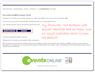
An ecommerce site with a number of shortcomings [1] - the worst of which was the final payment page which has just two buttons:

Submit Payment and Payment

WTF?!

alt text view fullsize [2]

[1] http://conceptdev.blogspot.com/2009/04/worst-ecommerce-website-ever-mkii.html
[2] http://4.bp.blogspot.com/%5FBa76y6K7kvs/SeRsGdvcfEI/AAAAAAAAA4c/HVLWVliwgFE/s1600-h/05.png

55
[+1] [2009-07-29 00:59:42] JohnFx

As discussed in my article [1], the one that infuriates me most and forces the most loss of work is the asinine decision of browser vendors to make the backspace key to do a browser backwards navigation. Also complicit are the designers of software like Wordpress who will let an accidental backwards navigation erase all of your work in the text editor without so much as a confirmation.

[1] http://improvingsoftware.com/2009/06/05/usability-rant-when-bad-design-decisions-become-standards/

Firefox 3.5.5 doesn't do it, but the war isn't over yet. Shift+mouse roll (as in, what you'd do to scroll a horizontal box) moves through the browser history. - Joey Adams
You sure about that? Firefox is where I first noticed the problem, but I think it depends on what has the focus. - JohnFx
56
[+1] [2009-07-29 01:40:48] David Plumpton

Videos that start playing (or even buffering) when I open a page on a background tab.


57
[0] [2008-12-29 23:16:02] David Thornley

Anything that doesn't actually work under either Firefox or Safari on the iPhone, for me. Second would be bad spacing, so images cover up text. (Presumably this would work on IE, but I'm not necessarily running Windows.)


58
[0] [2008-12-30 16:44:54] Rolf

Sony's PS3 operating system is a good example. Plug in a USB and discover that "X" does not show you it's contents, and pressing triangle actually also shows hidden files. Whoever thought of that is not a user interface guru.


59
[0] [2008-12-30 19:16:12] Jim

An infinite redirect loop while trying to log into Microsoft's webmaster central.

I knew it could happen, but I'd never seen it happen before that.


60
[0] [2009-07-08 03:58:50] Joe White

Pages that contain both real content that I want to read, and an incidental search box in the top corner, that "helpfully" put focus in the search box, so I can't hit the Down arrow to scroll through the content.


61
[0] [2009-07-28 14:54:44] lmsasu

Validating the phone number against a too strict format.


62
[0] [2009-07-29 01:52:38] Dave Jarvis

Not pre-populating a mailing address from zip [1] (or postal [2]) code, area code [3], and geo-ip [4].

[1] http://zip4.usps.com/zip4/citytown%5Fzip.jsp
[2] http://www.canadapost.ca/cpotools/apps/fpc/personal/findAnAddress
[3] http://www.nanpa.com/area%5Fcode%5Fmaps/ac%5Fmap%5Fstatic.html
[4] http://www.maxmind.com/app/geoip%5Fcountry

63
[0] [2010-04-06 07:42:21] alex

The old Australian Westpac bank app was IE only. It made me upset.


64
[0] [2010-04-11 23:45:24] Anurag

www.myspace.com


65
[-1] [2009-07-29 00:06:33] Slomojamma

A month or so ago, I was trying to renew my Flickr subscription and it failed for some unknown reason. Flickr did not give me any information as to why or who to contact. I tried a number of times that night and the next day with no success. Eventually I turned to Google to find a contact number for Flickr Billing. Turns out yahoo stored my old old address and assumed that this was still my billing address. The credit card company denied the initial transaction and my repeat attempts raised red flags. A week later I was finally able to renew...

I was AMAZED at how hard it was for me to give Flickr my money.


66
[-3] [2008-12-30 01:59:06] Jared

http://www.zonebbs.com is one big usability error. the creator of the site is blind and didn't bother asking anyone weather it looked decent. Although it's great if you use a screen reader I've been told it's painful on the eyes which helps explain why over 90% of it's members are legally blind.


i think you are confused. Usable doesn't mean necessary good looking :) - Ionut Staicu
If something is flat out ugly then it is harder to use which effects usability. - Jared
As It appears that the site is for blind people I would say it meets its useability requirements superbly. My only gripe as sighted user is the use of the script font for the page heading. Otherwise the it's a breath of fresh air in it's simplicity. - Jon P
67